Plaza de Armas, Viejo San Juan


Transformed several times throughout the years Plaza de Armas today is arguably one of the best public squares in Old San Juan, Puerto Rico. The current design -depicted above- is from the 1980’s and belongs to architect, Alberto del Toro (assisted by the dissolved firm Arce y Rigau).

The space was last rehabilitated almost two decades ago. The works dealt with minor repairs to the pavements and sitting areas, but additional trees were added. Fortunately, the new planting followed the existing structure and a second line of trees — of the same species — was paired with the existing. For that reason, the original spatial organization devised by the designers remained unchanged. Some could argue that it was reinforced with the addition.

Plaza de Armas is rectangular in shape, conformed by contiguous buildings along its four sides where two civic structures stand out, the Departamento de Estado o Real Intendencia to the West (right in the top sketch) and the Ayuntamiento or Alcaldía de San Juan to the North (center down in the sketch, also at the perspective below). It is worth noting that the space does not align with any of the afore-mentioned buildings. However, the skillful designer(s) organized the urban elements at their disposition to compensate for the ‘misalignment’.

Therefore, as illustrated, a telephone cabin, a fountain and a “glorieta”, along with the mass of trees — all composed to acknowledge and reinforce — the City Hall’s main axis, perpendicular to the plaza. The mass of trees further recognize the building’s protruding arcades and the towers that flank them. (See sketch below, illustrating this space back in 2002).

The space conformed by the surrounding buildings is rectangular. However, the space’s proportion is less important than the composition of the urban elements inside the paved area of the square. The arrangement is what really organizes the space. The paved area has a proportion of 1:3.5; one square wide by three and a half squares long. The alignment with the Ayuntamiento (as illustrated) is far more hierarchical than the alignment with the Real Intendencia. Nevertheless, two monumental light posts – no others alike are to be found in the square – recognize the Real Intendencia’s longitudinal axis. Thus, proving that neither the longitudinal or transversal axis of the rectangular geometry of the space (without relating to any structure) is as relevant as the axis created by the arrangement of elements drawn by the skillful hand of the designers.

A few hours at the Kimbell Museum of Art

Designed in 1967 by architect Louis I. Kahn and finished in 1972 in collaboration with landscape architects Harriet Pattison and George Patton; and structural engineer August Komendant. 

The museum can be accessed through either the lawn and the beautiful mass of yaupon hollies trees out in the entrance courtyard or the rear parking lot (to the East) one story below the main floor. 

Either way you enter, the spatial sequence of the building is magnificently clearly laid out. 

The museum is comprised of 16 parallel halls covered by 20 feet wide by 100 feet long post-tensioned reinforced concrete shells (or vaults). Each thin vault is supported by four reinforced concrete columns which can be visible throughout the building. 

Entrance courtyard with yaupon hollies and opened porches that overlook the water pools. 

Main vestibule looking towards the northern courtyard and main stairs connecting to the Eastern vestibule. 

The interior curving shells have light slots that allows for natural light to enter the galleries. Stainless steel reflectors bounce the natural light difuminating it throughout the curving vaults illuminating the gallery interiors with a soft well-distributed natural light. 

Casa Wiechers-Villaronga in Ponce, Puerto Rico

During the past summer days my wife Claudia and I led a team of students to prepare field notes and measured drawings of this turn-of-the-19th-century masterpiece designed by Alfredo B. Wiechers.

For the 2nd consecutive time- our students have been awarded 1st place at the Charles E. Peterson Prize Measured Drawing Student Competition (2015 & 2014). The competition is co-sponsored annually by the National Park Service, Heritage Documentation Program, The Athenaeum of Philadelphia and the American Institute of Architects. 

For more information about the Prize: http://www.nps.gov/hdp/competitions/Peterson_winners.htm

Here are a few sketches I made while assisting the team of students prepare their field notes and documentation drawings. 

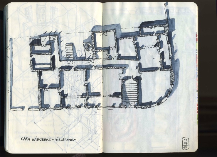
 Floor plan

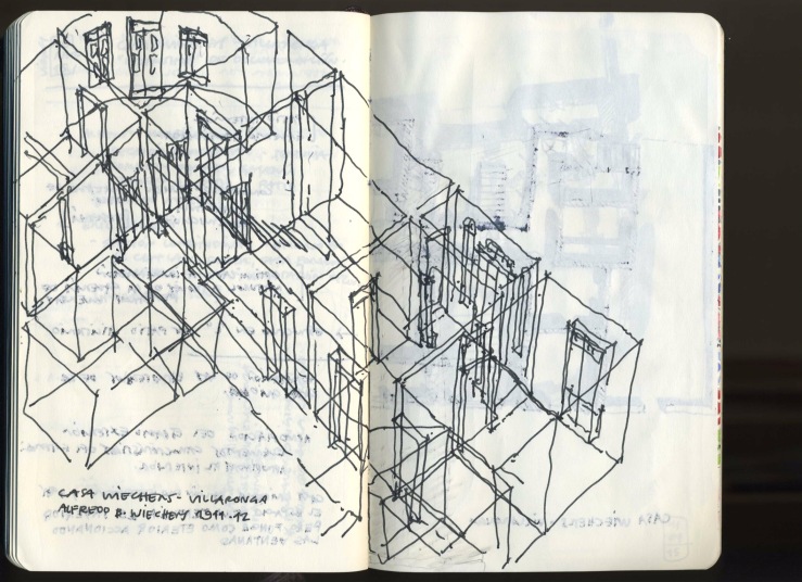
  Following the 19th century tradition I made a composition simultaneously illustrating both interior and exterior views of the dining room area. 
 
Although I like perspective drawings I prefer these analytical drawings. Even if too personal, (meaning that they are really not intended for others), these drawings are essential tools for helping me understand the spatial configuration (and relations) of given building.  

 For illustrating purposes, I have included this sketch of the main façade I made (and posted) a few years ago. 

Centro de Estudios Avanzados, Viejo San Juan (Antiguo Seminario Conciliar Español)

 Floor Plan and Longitudinal Section (partial, continues on next drawing).

Planta y sección longitudinal (parcial; continúa en el próximo dibujo).

  Longitudinal Section (continuation), Axonometric of principal spatial configuration. 

Sección longitudinal (continuación); axonométrico de los principales espacios. 

 Perspective of the Chapel. 

Perspectiva de la capilla.

Frank Lloyd Wright’s Frederick C. Robie House

Designed to evoke the expansive landscape of the Midwest, the Robie House characterizes horizontality with its forms, spaces and even construction materials. For example, the proportions and arrangement of the main living room and dining hall (one next to the other, aligned along their longitudinal axis) as well as, the repetition of the vertical windows and doors along these main spaces, underline the horizontality of the residence. Even the brickwork emphasize the horizontal plane. Roman brick (characteristically more elongated than regular brick) is set on cement mortar. However, contrary to tradition, horizontal mortar joints are differentiated from the vertical ones. The former are highlighted with white cement, while the latter are camouflaged with the red bricks.   Needless to say, the highlight of this masterpiece is its spatial sequence, which is exacerbated by the guided tour, although sadly, not by the tour guides. As with every great architectural work, one is guided by spatial elements and can easily traverse the spaces without having to repeat spaces along the spatial sequence.  As it was customarily for Wright, the main entrance of the house is hidden away from the street. Setback from the sidewalk, the entrance allows passage through the northwest side to the under level where a staircase invites you to climb towards the lighted upper level. Once upstairs, the space opens up towards the living room while circling the fireplace that divides the living room from the dining room. From the living room the view opens up towards the street inviting one out to the open terraces. The continuous horizontal band of the wood and stained glass doors invites to the dining room concluding the spatial sequence of the main spaces.        

Frank Lloyd Wright’s Home and Studio in Oak Park, Illinois

Until fairly recent I wasn’t a big fan of Frank Lloyd Wright. For some reason since my days at school of architecture I’ve always rooted against the great masters in favor of secondary-role (thus lesser known) architects. Even if I still root for the underdogs, nowadays — forced in great part by the impartiality required to teach objectively a course on History of Modern Architecture — I’ve come to really appreciate and understand the works of architects such as Wright.

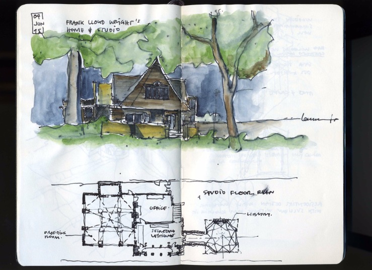
During my trip to Chicago, where avoiding Wright’s work was simply not possible, I visited several of his buildings including his Home and Studio in Oak Park. At first I felt like it was going to be business as usual but there were so many instances in this place to ascertain Wright’s greatness as an architect (even if personally I still believe he was a huge S.O.B.) that if I had just visited this one place I would have felt the same way about his work. The structural achievements, material selections, attention to details and quality and greatness of its interior spaces all attest to his place in history as one of the most influential architects of the century.

Here are a few sketches I made during my visit.

  House main elevation and studio floor plan

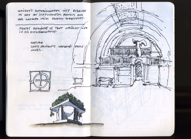
 Notes and drawings of the hallway connecting the house and studio and an axon of the dining room, as well as, a detail of the dining room’s glass windows floral motif.

  Axon of the studio.

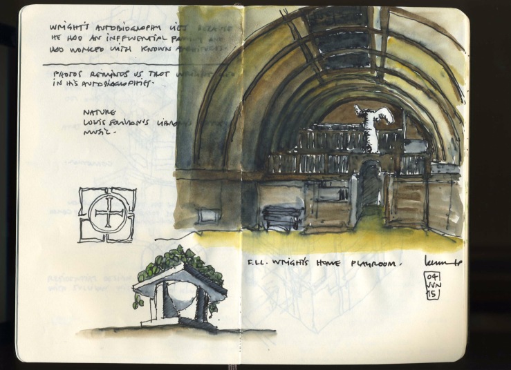
 Un-rendered and rendered perspective (below) of the playroom.

Mies van der Rohe’s Farnsworth House

The National Trust for Historic Preservation is considering relocating Mies van der Rohe’s Farnsworth House out of the Fox River floodplain. The idea is to move the structure from its original location parallel to the waterway to a nearby site, still along the river, but on a higher elevation. Throughout the years the house has been affected significantly by floodwaters at least three times. The last major damage occur in 1996 and the restoration costs elevated to almost half a million dollars. At that time, the flood broke windows, damaged the travertine marble floors and ruined the teak cabinetry.

The solution of moving the house is not the only one the Trust has juggled in order to protect the house from further damages. Two additional solutions not requiring to relocate the house have been contemplated so far. One — less viable, although favored by Dirk Lohan, a Chicago based architect and Mies’ grandson — requires the installation of hydraulic jacks underneath the foundations to lift the house during floods. A second one, provides to permanently raise the house on top of a 9-foot mound.

Each one of the alternatives entail major impact on the National Historic Landmark and needless to say, has raised many eyebrows not only on preservationists, but also throughout the architectural community. One of the leading voices is Mr. Lohan who was in charge of the 1996 restoration. He argues that moving the structure “…is not in keeping with the design concept of the house, which was a house in a flood plain, close to the river…The river was part of its immediate environment. To move it to higher ground where it never floods would be ridiculous. You would ask: ‘Why is it on stilts?’ It makes no sense to me.” 

Having visited the house for the first time last month I really don’t see the problem with moving it. Arguably, given the nature of the house, an elevated object that relates to the river just by being in proximity to it and not much else, I see no problem in relocating it to a higher site to relieve the enormous preservation pressure and most importantly avoiding escalating restoration costs. 

One knows that the success of the strategy depends on the execution and the careful conditioning of the new site to retain the overall experience. Nevertheless, I strongly believe that regardless of its location the house will continue to inspire future generations if the right action is pursuit, sooner rather than later, in order to move it out of harm’s way.